How are you contrasting?
I’m not sure that question really makes sense, but I feel like that probably doesn’t matter. Often times when working on projects, particularly personal projects, we adopt the default color schemes and palettes of whichever CSS framework we are using. Maybe that’s Bootstrap or Tailwind. And that’s fine, but if you want to get a bit more serious about your colors, there are some interesting tools to allow that. Here are a couple which attempt to keep accessibility a bit more front of mind.

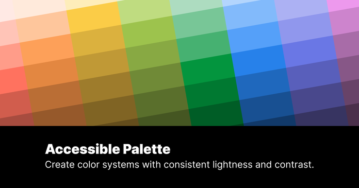
Accessible Palette
Create color systems with consistent lightness and contrast. Not all contrast is the same, at least according to our eyes, and some of the current approaches to measuring it are not as useful as they could be. Accessible Palette attempts to provide a more consistent set of contrasts for each of the hues. It also shows contrast using the WCAG 3 Draft method.
https://accessiblepalette.com/
Huey
Rapid color palettes across the rainbow. Huey is great for instantly generating color palettes for use with CSS variables, SCSS, and JavaScript, and exports markup for Tailwind, Bootstrap, and PostCSS frameworks.

Windi CSS
Next-generation utility-first CSS framework. This isn’t a palette generator, more of a consumer. I know I’ve mentioned TailwindCSS a few times, and Windi CSS is a related project with the same goals. The classes are mostly, if not exactly, the same as Tailwind but the implementation and integration are different. Either way, I still find it nicer than doing CSS the traditional way.
